jaGUar Mk2 – The Type 00

December 4, 2024
On November 18th, jaGUar relaunched its brand to a, ahem, response. That response? Well, it leaned heavily toward the side of abject horror and disappointment – and honestly, we can’t say we blame anyone. After all, we were in the same boat. It felt a bit like watching Edinburgh Castle being torn down to make way for a new B&M store. We’re not naïve, though. We get it. Jaguar was in a near extinction-level state of flux, and something needed to be done. But, um… this wasn’t exactly what we had in mind. Anyway, we’ve already beaten that drum and made it clear that we prefer Jaguar the way we like Michelangelo’s David – sans fisherman’s hat, moustache, and flannel shirt.
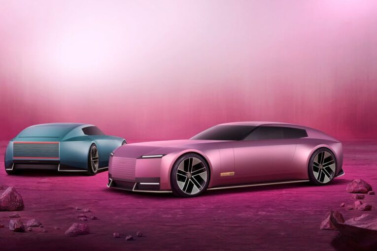
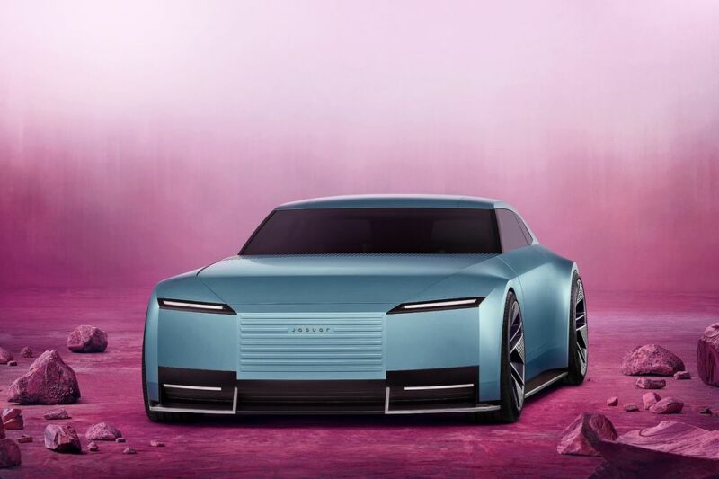
What we do want to discuss is the rather aptly named Type 00 concept, revealed to the world a couple of days ago in Miami. Now, the “00” could either be a bold statement of intent to start from scratch – or perhaps Jaguar has developed an unexpected passion for premium flour. Whatever the case there had been a few glimmers of hope in the weeks leading up to the reveal, which, as die-hard fans of ‘traditional’ Jaguars, sent us on a pretty wild emotional roller coaster. Before the rebrand, some images of the prototype surfaced online, and we couldn’t help but think that the heavily disguised, angular body was hiding something potentially special. After all, a camouflaged prototype shouldn’t give away too much, right?
Then came the rebrand itself. After the rumour mill had time to churn, one question started to dominate the conversation: Had Jaguar completely bamboozled us? Could all of this uproar just be an elaborate PR stunt? Think New Coke levels of misdirection. We clung to a faint hope that the big reveal would present a jaw-dropping design that would reignite the passion of petrolheads (or maybe voltheads?) everywhere. Then December 2nd happened. Our jaws did technically drop – but so did our hearts.
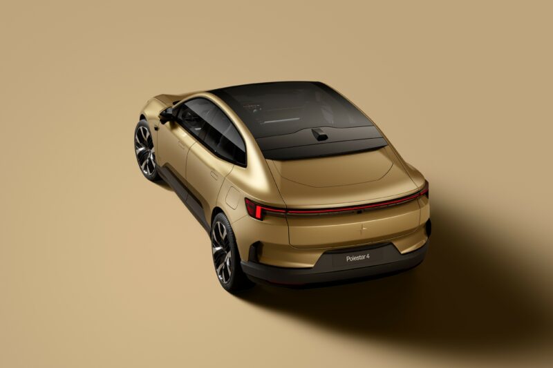
Let’s start with the styling, and here’s where we hit our first problem. The “Copy Nothing” slogan has been heavily touted in all the recent Jaguar media. However, it seems Jaguar may have, well… copied something after all. The controversial omission of a rear window has sparked a lot of discussion, and when you make a design choice that bold, it really has to live up to the brand statement. Unfortunately, this isn’t exactly groundbreaking – Polestar beat them to it with their Polestar 4 model. So much for “Copy Nothing” then.
Copy nothing. OK, well maybe just a few bits…
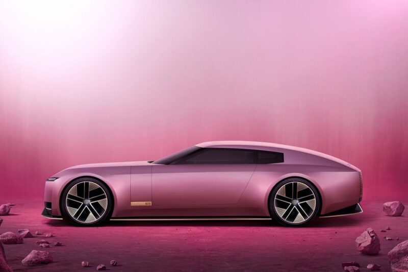
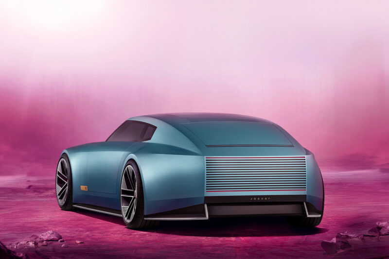
From the rear 3/4 view, it’s hard to ignore the striking resemblance to the Chrysler Crossfire concept revealed back in 2001. And overall, there’s a distinct hint of the Rolls-Royce Sceptre in the mix too. So, while it might not be “copying nothing”, it’s certainly echoing a few past designs. Then there’s the HVAC unit, which looks like Jaguar just glued it to the back for fun. We’re still not entirely sure what purpose it serves, other than to stand out as a Brutalist piece of pointless design, which feels a little at odds with Jaguar’s new “Exuberant Modernism” mantra. Maybe the air conditioning is just really enthusiastic?
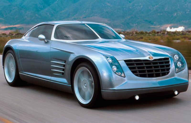
Chrysler Crossfire concept
We don’t mind the wrap-around, pillar-less design of the glass – it’s sleek, no doubt. But once again, this isn’t exactly new territory. Saab first pulled this off with the stunning Aero X concept back in 2006. Honestly, we feel Jaguar might owe a little more than just the glass design to that car. There’s definitely more than a hint of shared DNA here.

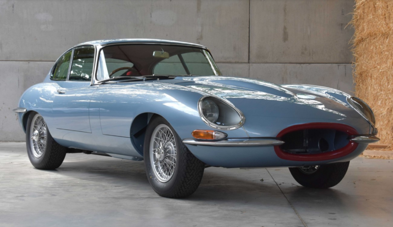
The side profile offers some slightly better, though still puzzling news. There are subtle hints of the Bugatti Atlantic and the Pierce Silver Arrow, which is… interesting. But perhaps more relevantly, in the shade of London Blue, there’s a whiff of the iconic Series 1 FHC E-Type about it. Maybe that’s not a coincidence, given that Jaguar has claimed the colour is inspired by the ‘Opalescent Silver Blue’ seen on various Jags from the ’60s. So, a blue that was inspired by a blue.
We can’t help but feel this is a somewhat tenuous, last-minute attempt to appease the purists who’ve taken issue with Jaguar’s apparent abandonment of its own heritage. Opalescent Silver Blue wasn’t even associated with the launch E-Types, and in truth, it wasn’t a particularly unique hue in its own right. Alvis, for example, had a very similar blue on their cars. If Jaguar was so eager to make that heritage connection, surely Jaguar Racing Green would’ve been the obvious choice? Something with a bit more bite, perhaps? As for the front… Hammerhead Eagle-I Thrust. We’ll leave it at that.
The fact that it does resemble a Series 1 E-Type FHC from the side is, well, a bit odd. It sends out a very mixed message about what Jaguar really wants to be or who it’s trying to sell to – at least from an exterior perspective. It’s almost as if it’s trying to channel the past while simultaneously charging into the future, but without really deciding where to land in between. The result? An identity crisis.
We know which we prefer…
This is especially baffling considering Jaguar has openly stated they’re not trying to appeal to traditional customers. So, throwing in a retro homage here makes little sense, especially when you consider the younger, more forward-thinking audience they’re aiming for. It’s as if they’re trying to have it both ways – capturing nostalgia while also trying to push boundaries – except neither approach feels fully realized. The past and the future colliding, but not quite fitting together.

With the interior, it becomes a little clearer who they’re aiming to sell this car to: couples who really don’t like each other. That’s the only explanation we can come up with for the bizarre central spar that divides the driver from the passenger.
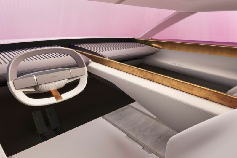
And it’s not like the driver will have much to focus on either, because in their quest to “delete ordinary”, Jaguar seems to have deleted everything else. We get it – luxury is often defined by space and light – but this minimalist approach might be taking it just a tad too far, especially when they plan on charging six-figure sums for the upcoming range. We know it’s a concept car, but the interior is the centrepiece of a luxury car. It’s all well and good having a dramatic body, but your sitting inside the car, not on the roof.
So when we see a design that looks as though it’s permanently in low resolution, like a ’90s PlayStation game, we’re left wondering: what’s happening over at JLR HQ? Did they outsource the interior design to an actual arcade machine? Answers on a postcard, folks. And if that upsets you, just imagine dropping £100,000 on a car and then having to stare at an Austin Allegro-inspired “quartic” steering wheel. Swing and a miss, Jaguar.
![]()
How it should be done – the Hyundai N Vision 74
Overall, it simply doesn’t feel inspired, nor does it live up to the promises of “deleting ordinary” or “copying nothing.” Instead, it’s a confused jumble of hyper-modern elements, sprinkled with a dash of Art Deco and Brutalist sensibilities. There’s a right way to blend the futuristic with the retro – just look at Hyundai’s utterly fabulous N Vision 74. It’s subtly futuristic where it counts, and retro everywhere else. It knows exactly what it wants to be. Jaguar, on the other hand, seems to have tried too hard to mix futuristic and retro aesthetics into a single design, and the result is a car that has no clue what it wants to be. It feels like it was designed by 30 different people, none of whom have ever spoken to each other. In the case of the ‘Miami Pink’ example, it’s the automotive equivalent of someone trying to explain what FAB 1 looks like after a bottle of Absinthe… via phone… at 3am.

It’s hard to wrap our heads around why a company would stage such a massive rebrand – one that sent seismic shockwaves around the world – and then follow it up by revealing a concept car that’s clearly not road legal in any realistic sense. We suspect the production version will have to undergo a serious redesign, meaning the car that actually makes it to consumers will likely be a very different beast.
If the “shock and awe” concept, which is meant to showcase Jaguar’s new company mission, fails to live up to those bold expectations, then a watered-down end product is only going to disappoint even more. You know when you pick up a bargain and ask someone what they think it cost, and they guess a price that’s way lower than what you actually paid? Yep, that’s the vibe we’re getting here. Expectation: high. Reality: a little lower.
Perhaps this would be a different story if it weren’t a Jaguar. And while that’s kind of the point of all this, we can’t shake the feeling that the only reason this car will succeed is because it’s a Jaguar – not necessarily because it’s good. And that, in turn, makes the name even more important, which places an even heavier weight on what Jaguar does next. It’s a lot of responsibility for a company that wants to “start from scratch” with a name steeped in history.
Over to you, jaGUar. No pressure.

